MONITOR
Once you’ve added variables in the Connect step, they are automatically available in the Monitor Dashboard.
The Monitor feature allows you to visualize these variables in real time, helping you understand system performance and behavior.
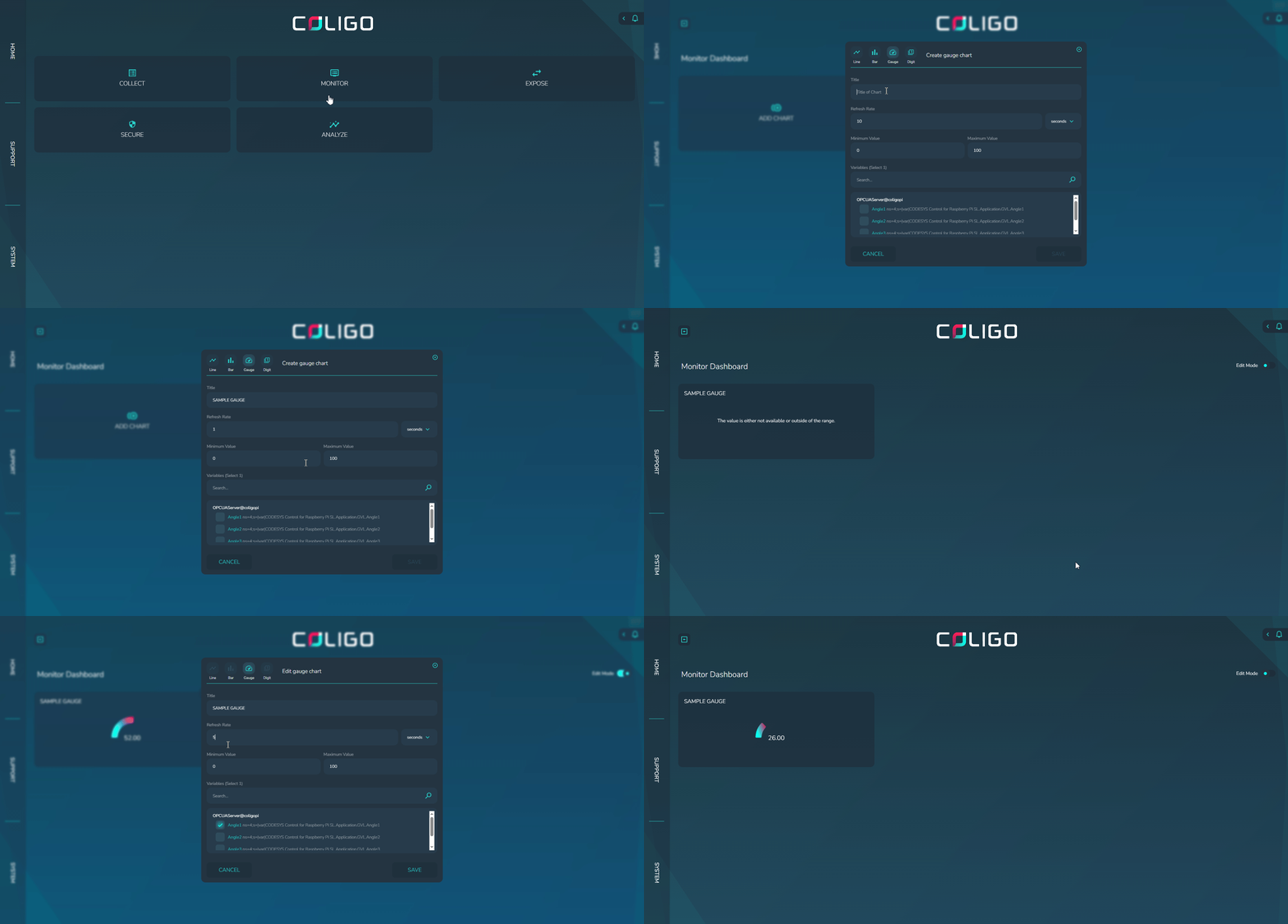
1. Access the Monitor Dashboard
- In the SYNA web interface, navigate to MONITOR.
- Click Monitor Dashboard.
2. Visualization Options
You can monitor each variable using four visualization types:
| Visualization Type | When to Use It |
|---|---|
| Line Chart | To view variable trends over time (e.g., speed profile, temperature changes). |
| Bar Chart | To compare variables or visualize levels (e.g., acceleration, resource usage). |
| Digit | For real-time numeric values (e.g., exact sensor reading, counters). |
| Gauge | When you need a dial-style view with limits (e.g., speed %, load). |
3. Adding a Visualization
- From the Monitor Dashboard, click Add Chart (or the respective visualization type).
- Select the variable you want to display from the available list.
- Configure the display settings (e.g., update rate, min/max values for gauges, time range for charts).
- Save the visualization — it now appears on your Monitor Dashboard.
4. Customizing Your Dashboard
- You can add multiple variables to the dashboard using different visualization types.
- Visualizations can be moved, resized, or deleted for a personalized layout.
- Saved dashboards will be available on your next login.
5. Finalizing Monitoring
✅ Your Monitor Dashboard is now set up.
You can observe your variables live, track performance over time, and adjust visualization formats as needed.
6. Chart Options
Each chart in Colligo Monitor provides customizable options to control refresh behavior, time range, aggregation, and size. The available options differ depending on the chart type.
Line and Bar Chart
The Line Graph supports the following configurable options:
-
Title
Custom text label displayed at the top of the chart. -
Refresh Rate
Defines how frequently the chart data is updated.- Supported values:
seconds,minutes
- Supported values:
-
Time Range
Defines the period of data to be displayed in the chart.- Supported values:
seconds,minutes,hours,days
- Supported values:
-
Aggregation
Defines how the data is aggregated over the selected time period.- Supported values:
milliseconds,seconds,minutes,hours,days
- Supported values:
-
Chart Size
Defines the display size of the chart.- Supported values:
medium,large
- Supported values:
-
Variable Limit
You can display up to 2 variables in a Line or Bar chart.
Gauge
The Gauge chart has a limited set of configurable options:
-
Refresh Rate
Defines how frequently the chart data is updated.- Supported values:
seconds,minutes
- Supported values:
-
Minimum Value Defines the Minimum value range for the gauge
- Supported values:
numeric
- Supported values:
-
Maximum Value (numeric) Defines the Maximum value range for the gauge
- Supported values:
numeric
- Supported values:
-
Variable Limit
Only 1 variable can be displayed in a Gauge chart.
Digit
The Digit chart provides only a single configurable option:
-
Refresh Rate (
seconds,minutes) -
Variable Limit
Only 1 variable can be displayed in a Digit chart.
7. Troubleshooting
-
No variables available?
- Ensure you’ve added variables in the CONNECT step.
-
Data not updating?
- Verify that the device is still connected to the server.
- Ensure the OPC UA Server date and time are correct (check the source timestamp of the variable) and synchronized with SYNA.
- Review the Refresh and Aggregation Rate settings, as longer load times may delay updates.
-
Visualization not rendering?
- Check your browser compatibility (Chrome or Edge recommended).